MRKR
Brand identity • Packaging Design
Brief: Ideate a new and meaningful packaging solution to an existing packaging problem that I identified from market research.
!!! Uni assignment

Market Research
The first task on the agenda was to perform some market research. Having worked in a stationery store I was always shocked at how much plastic waste was generated by that industry.
When I then went down to my local Officeworks I was also floored by how their packaging design also felt very homogenous with little to no character from any of the brands present.
Brain Storming & Concept Iteration
Next it was onto brainstorming and developing some ideas for how the brand would work. I was deliberating between two options: Spectrum and MRKR.
Regardless of the name, I wanted this brand to focus on the demographic of creative people and to use a design language that was a clear point of difference to what is currently on the market.


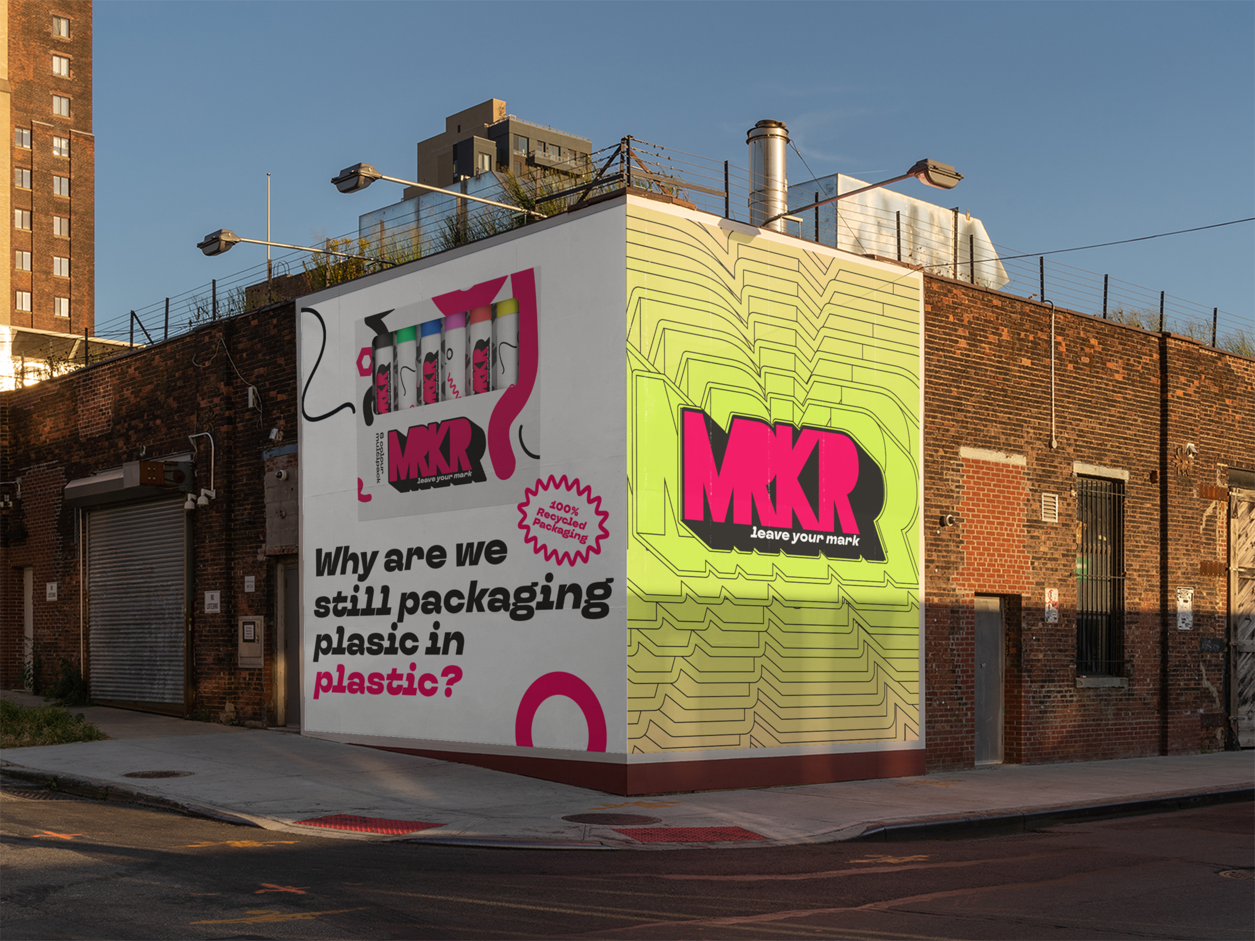
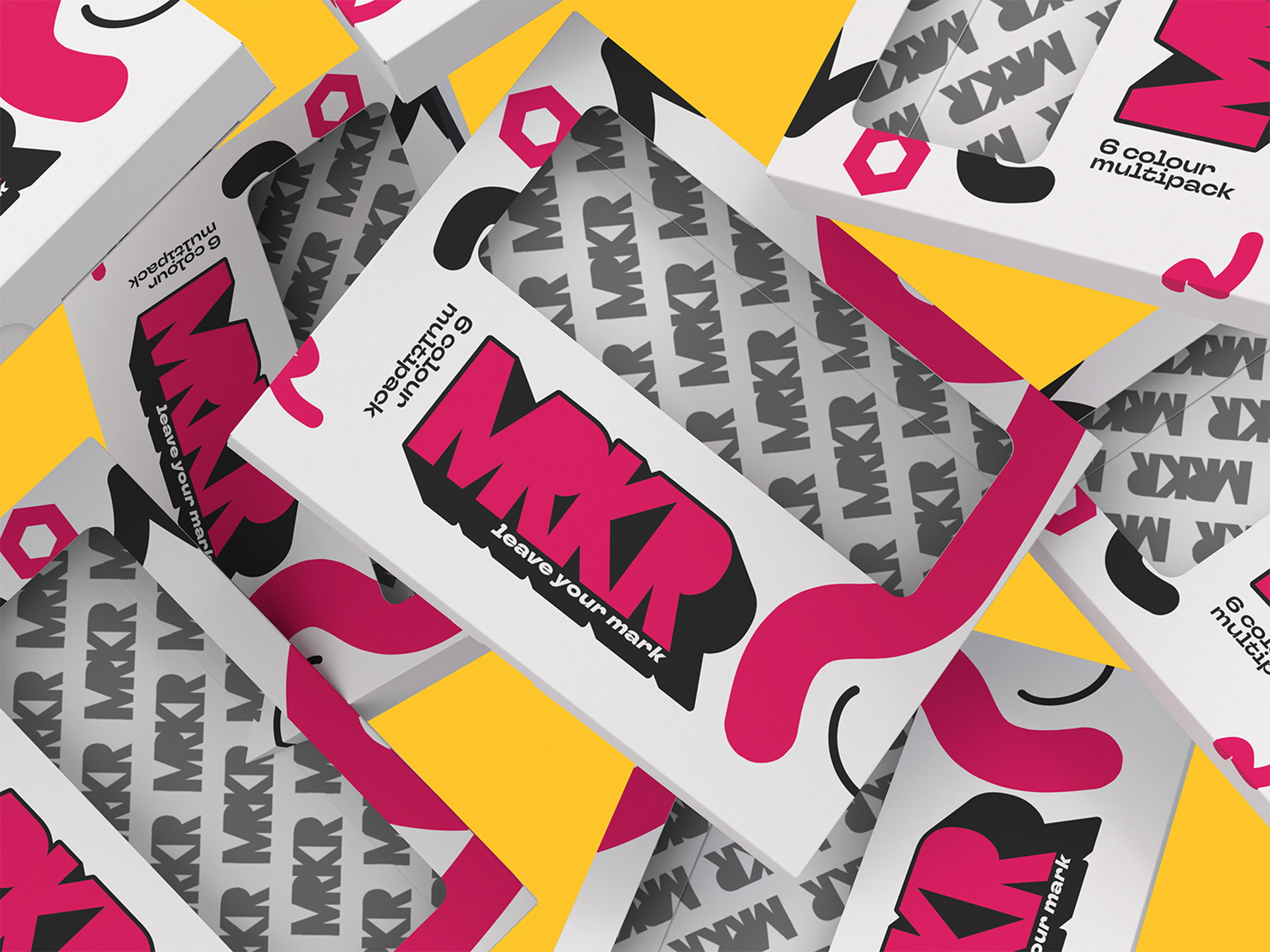
This is the final concept for the MRKR brand.
This branding with its bold colour palette and strong typography are at complete odds with the current design trends in the marker market, matching the voice of the brand perfectly.
The unique design language that was developed can be taken even further when applied to the packaging and marketing materials.
For example the promotional stands have dedicated panels for testing the markers converting them into a community art piece, the poster and window advertisements can be collaborations with local artists. The possibilities are endless.
All of this design is also bolstered by the fact that this is the only marker brand using 100% recycled materials for their packaging.