Master the Art
Brand Design • Collateral Design
Brief: Create a stronger, more cohesive visual identity for a family friends business.
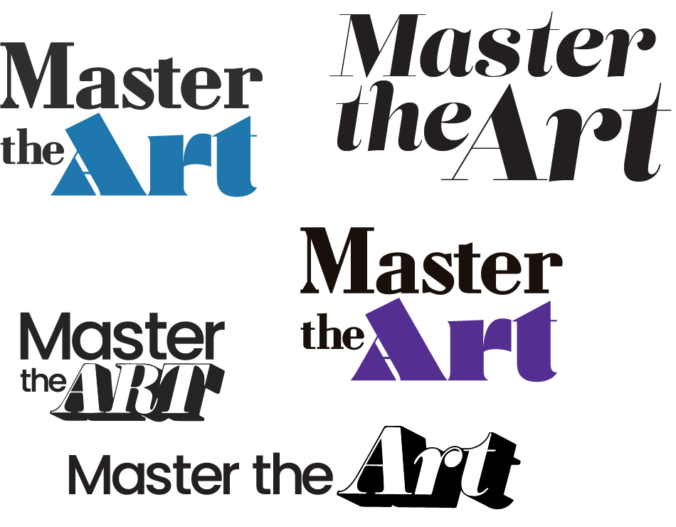
This was one of the more challenging visual identity projects that I have undertaken so far. The main challenge was how unique this business is, they offer guitar, singing and music theory lessons and also hairdressing!
They were in desperate need of some cohesion across the entire brand and I was more than happy to help. However I quickly discovered that this was going to be one of the hardest brand projects that I had worked on, trying to find the correct composition and typeface that suited their voice was proving extremely difficult.
The concept of this entire brand came to me where all great ideas are generated….the shower!
Having these breakthroughs is always the most satisfying part of any design problem for me. Particularly after having so much trouble with the initial concepts and not being happy with anything I was creating. Once I had this breakthrough everything fell into place.
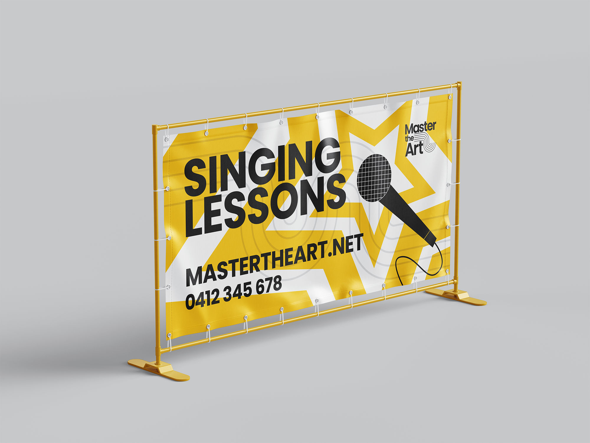
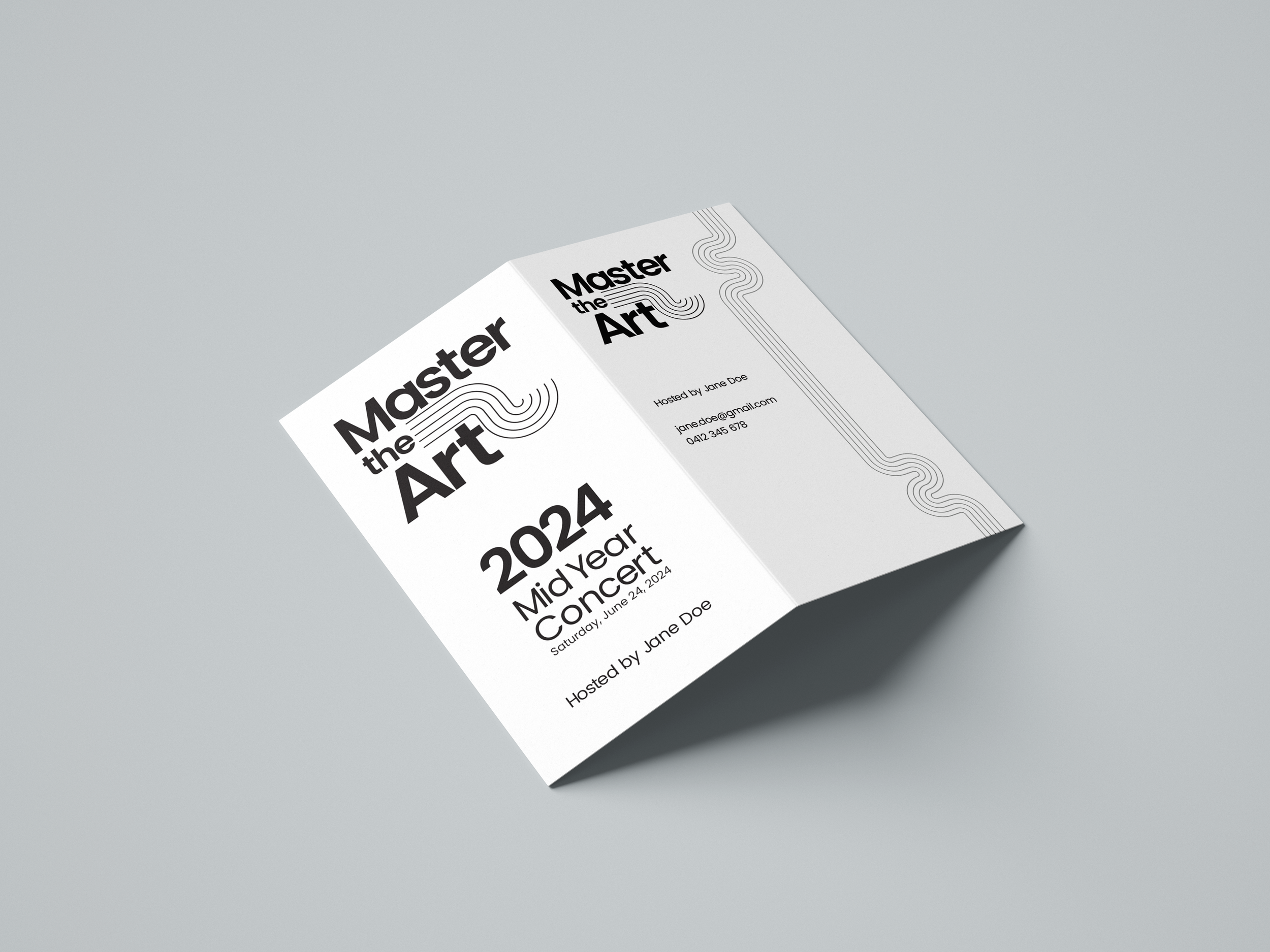
Yellow was chosen as the accent colour to capture both of the clients high-energy, passionate teaching style and their enthusiasm in helping their students improve.