Ginan Observatory
Brand identity
Brief: Develop a new brand identity for the River Murray International Dark Sky Observatory, a state-of-the-art observatory in South Australia.
The design should capture both the observatory’s essence and its impact on the surrounding region.
!!! Uni assignment

Current Brand Assessment
This project started by reversing the brief given to us by the real world client. An employee of the River Murray Council in South Australia.
I also completed a quick audit of their current branding to get a grasp on where they were sitting currently from a branding perspective.
They have great ambitions for this project and it was exciting to contribute my ideas. However, while they were ambitious I thought it was important to narrow their target audience to match the where the project was currently at.
I took inspiration from the 2000s Olympics and chose to develop a brand purely for securing funding with the idea that this brand would subsequently evolve in time when the project was complete and ready for the general population.
Market Research & Concept Iteration
Next it was onto market research. There were already several competitors in the “Dark Sky Tourism” space with two competitors operating in the same state. It was important to focus on what made this site stand out from the others.
With this competition it was important to tackle the name. The current name for the observatory was the: River Murray International Dark Sky Observatory, or RMIDSR for “short”.
It was fundamental that this name change. Not only was it too long and not memorable but through my research I found that even most astronomy enthusiasts were unfamiliar with the term “Dark Sky” so it had no staying power. For the success of this project it was essential that the name change.


Whilst conceptualising ideas I realised that when rotated 90 degrees the one of the stars in the southern cross lands perfectly in the state of South Australia.
I looked up what the names of these stars were and this stars name was “Ginan”. “Ginan Observatory” is not only much easier to remember it also has a call to action in it’s acronym which could prove invaluable in marketing material.
Once I settled on this design I started sketching thumbnails to try and devise a way to bring this concept to life.

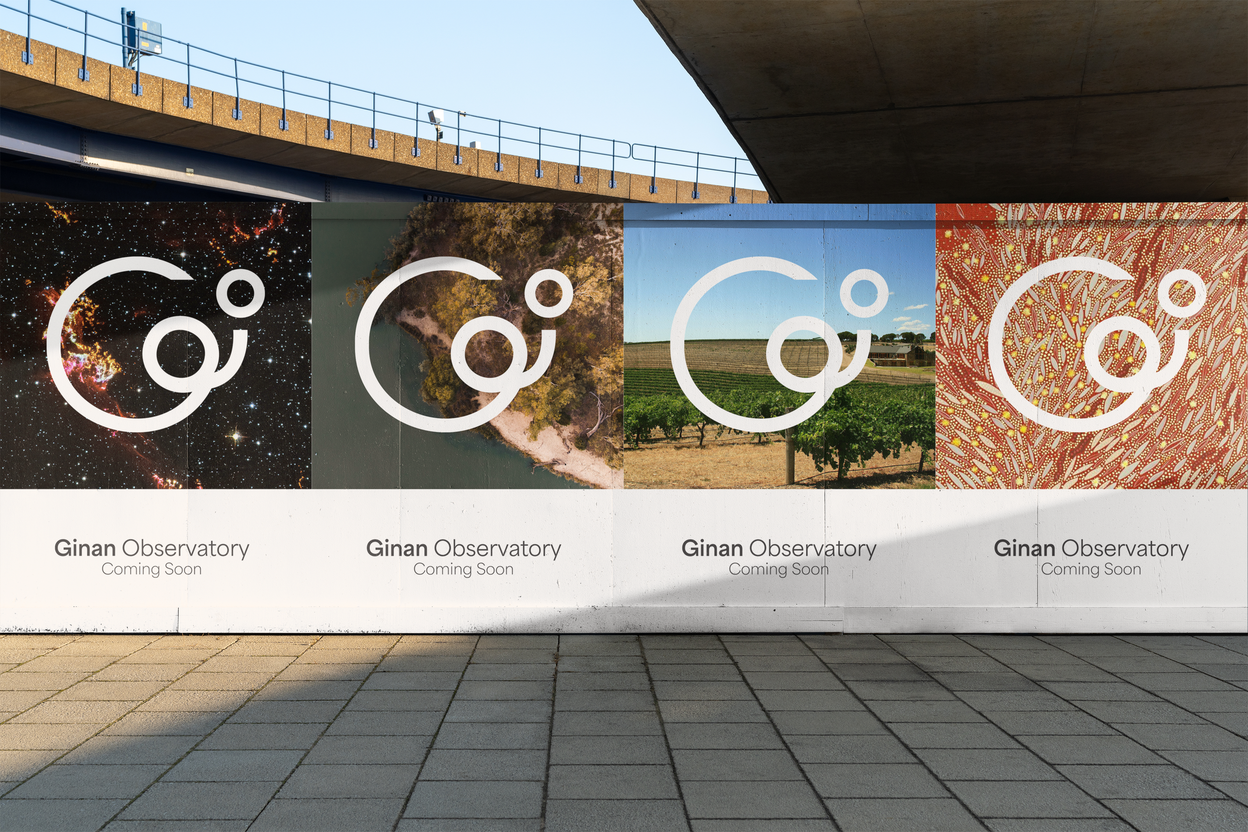
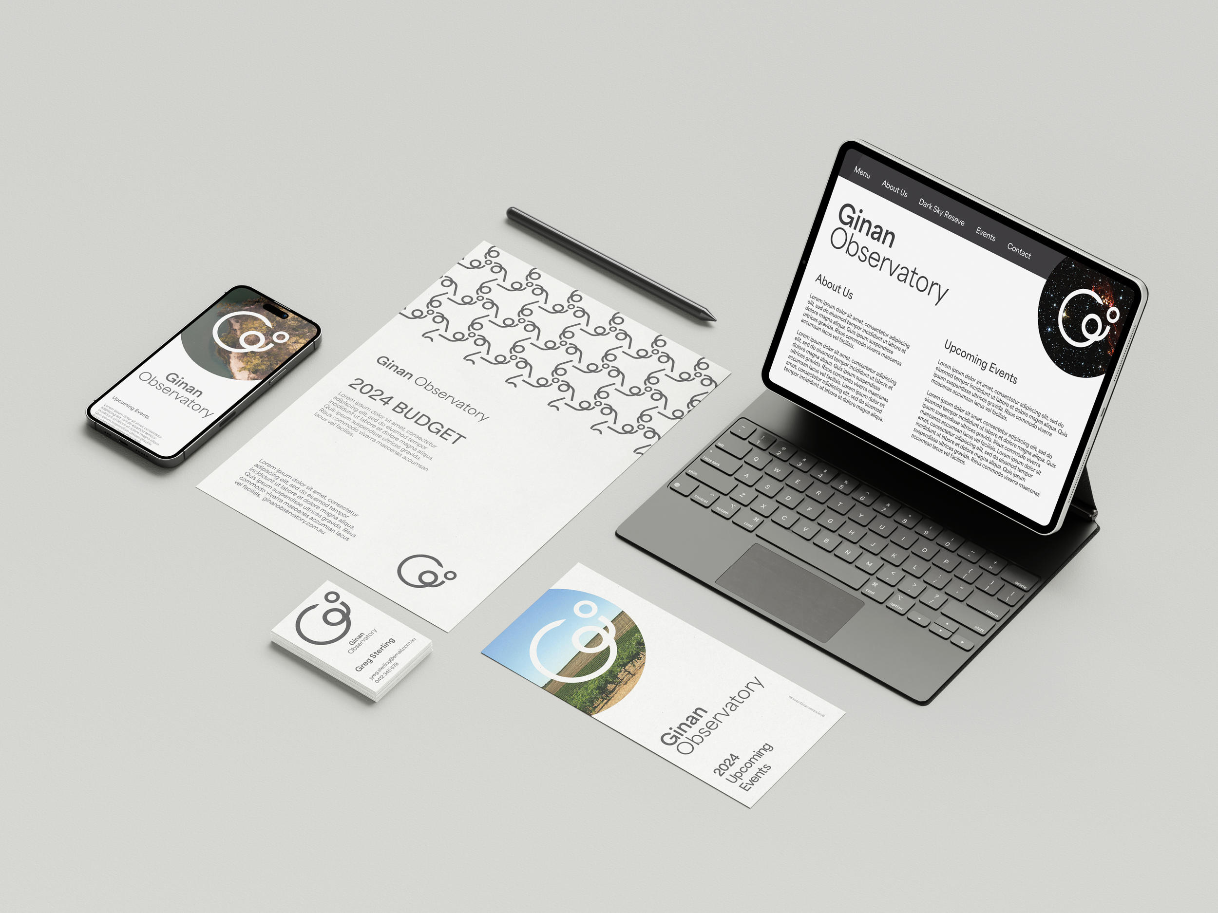
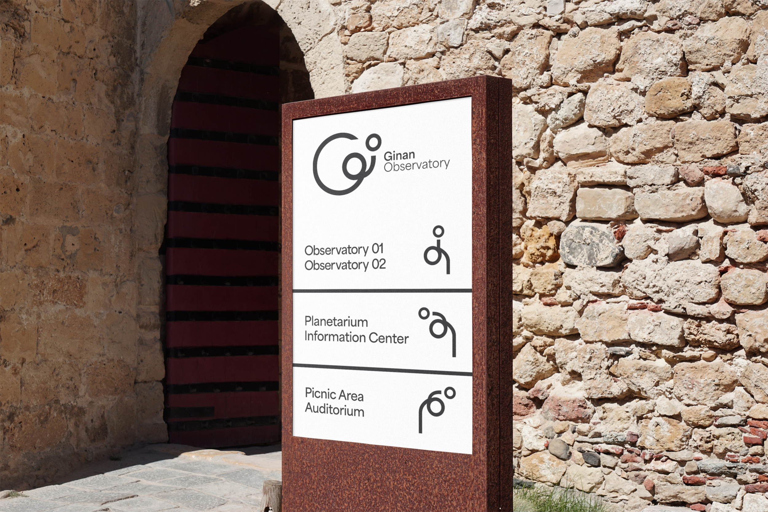
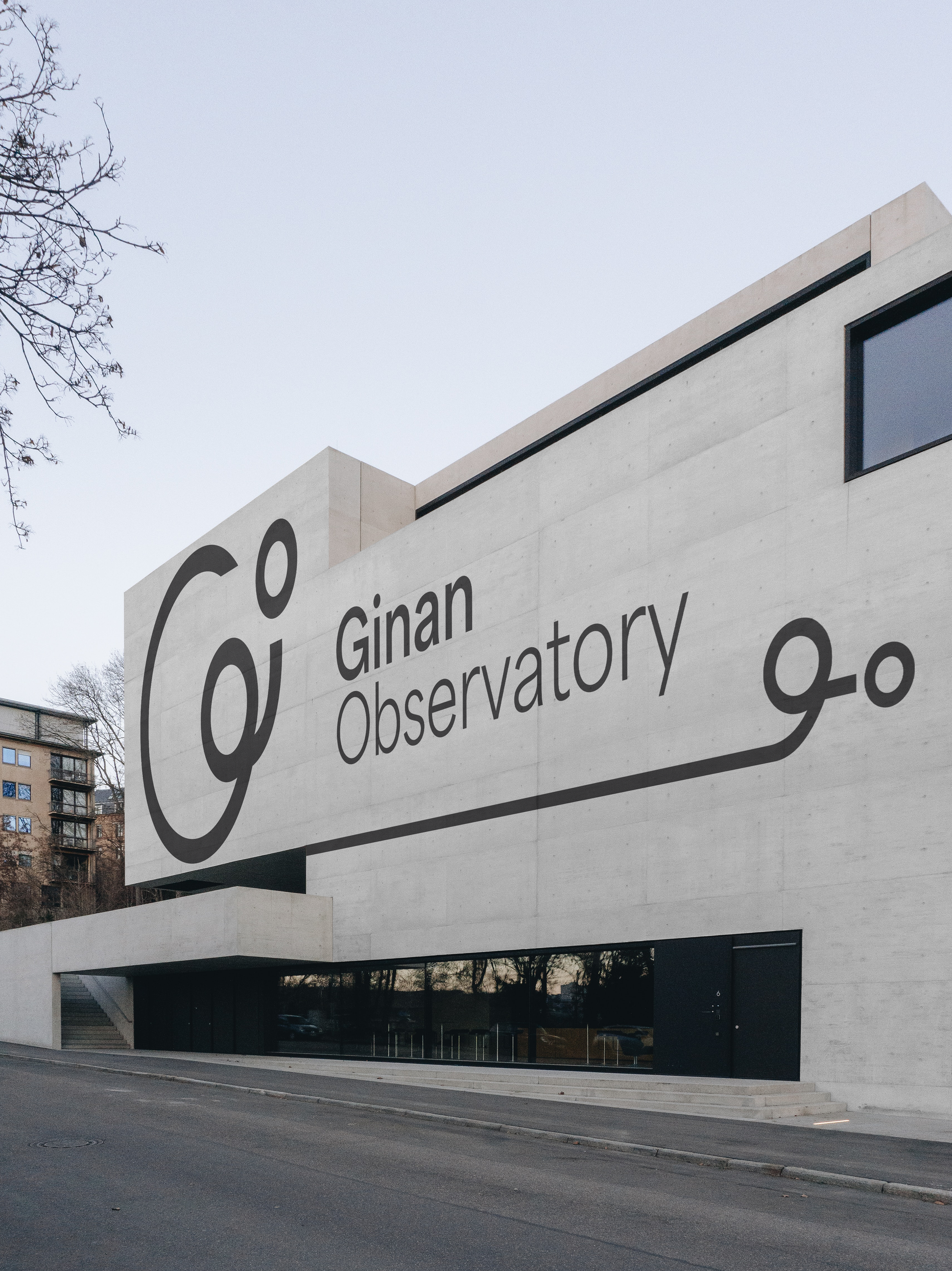
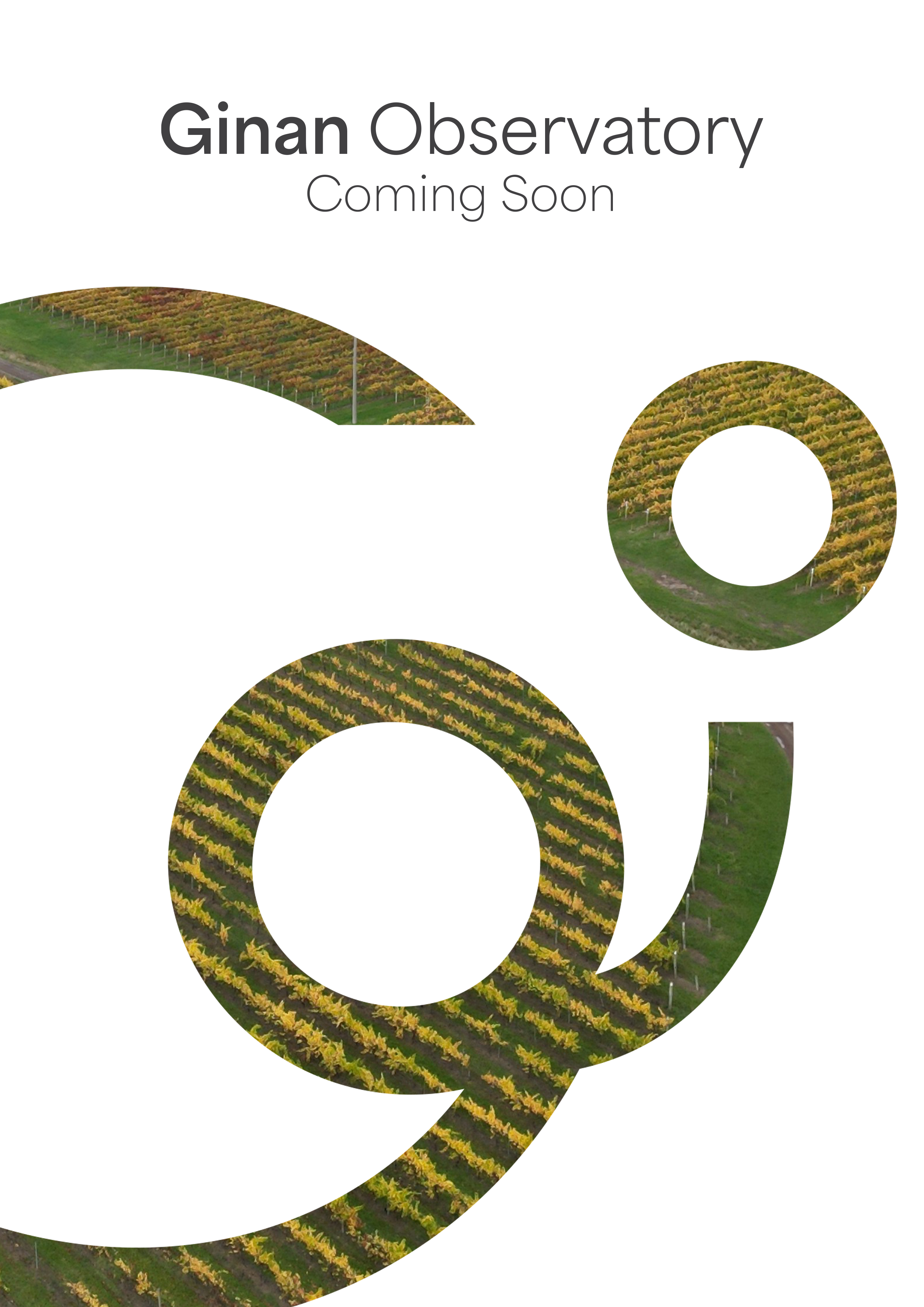
This is the final concept for the Ginan Observatory.
This was a complex task with many goals, expectations and stakeholders. I am really happy with the brand identity that I developed, it’s minimal professional design serves the re-assessed target audience and gives the brand the sophisticated confidence of a cutting edge science facility.
The complimentary typeface Area was the perfect choice as it reflects the round curves of the logo giving the design a sense of completeness.
The logo itself is not only an abstract wordmark but it also represents an object under the influence of gravity and the path of an object leading to the “O”.